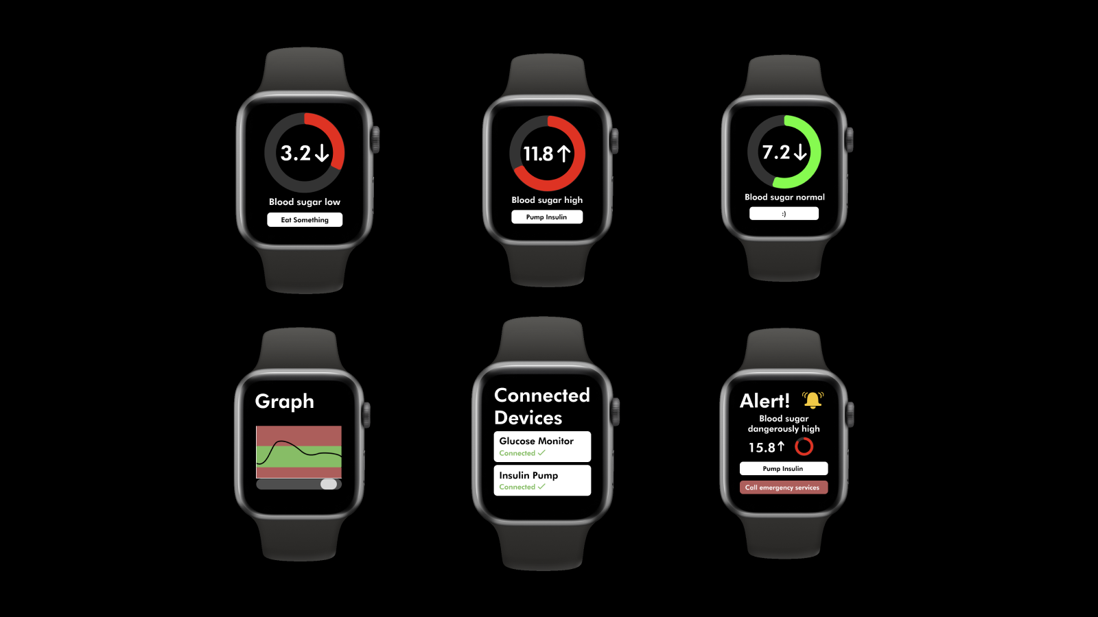
The brief for this project was to create a smartwatch app of my choosing. I decided to make an app for diabetic people that would help them monitor and manage their blood sugar levels. It displays your blood sugar levels, alerts you when they're too high or low and connects to other devices so you can pump your insulin straight from the smartwatch.
The audience for this app is diabetic people looking for an easier way to manage their condition. Some of the most important things to consider when making an app like this is whether it is actually useful for the users, and in what way it is going to help them. I had to take this into account during this project.
During the empathize stage, I conducted research into how target users use existing apps and devices for diabetes. I also had to do research into diabetes itself to make sure the information I was including in my app was accurate. I also did research into other kinds of smartwatch apps to get a better idea of what works well when designing for a small screen.
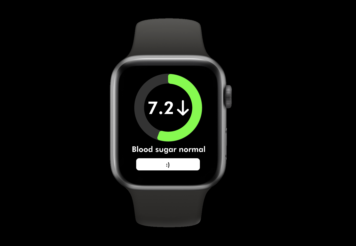
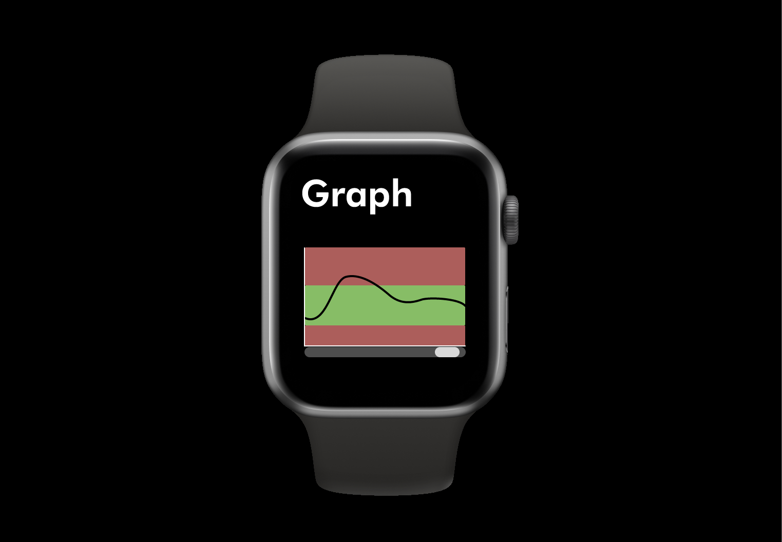
Using insights gained during the empathize and define stages, I entered the prototype stage. I created prototypes starting with low-fidelity wireframes to my final high-fidelity mockups, iterating my designs as I went. I made sure to include key features like real-time blood sugar monitoring, insulin management, and clear alerts for dangerous levels. I paid special attention to designing an interface that was easy to read and interact with on a small smartwatch screen. The use of color coding and simple icons helped to convey information quickly and effectively.
Throughout the project I continously tested and refined my project to ensure its effectiveness in achieving its goals. I continously gathered feedback to help improve my designs, including during a critique session where I got feedback on how to improve my designs. The main feedback I got was to focus on making the element big enough to interact with on a smartwatch screen and focusing on not overloading a single screen with too much information.